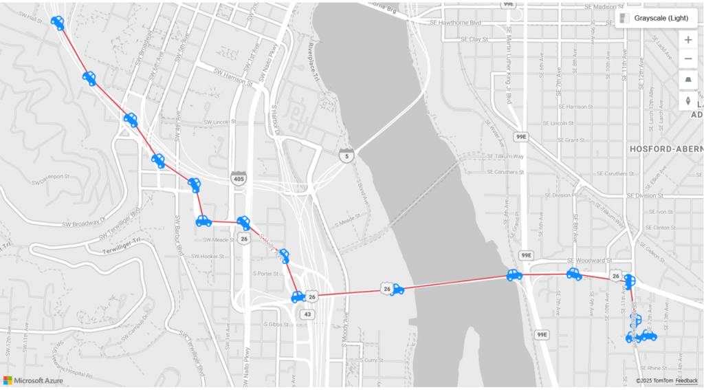

Microsoft has announced a powerful new feature for Azure Maps visual in Power BI: the new Markers. This key improvement allows you to create interactive maps that are much more visual, expressive, and business-oriented, without the need for complex GIS tools.
Thanks to Markers in Power BI, organizations can build data-driven geographic stories much more clearly, improving the visual interpretation of information and geospatial analysis within their Power BI reports.
Markers in Power BI represent a step forward in geospatial visualization, as they allow users to intuitively differentiate points of interest, facilitating decision-making based on the location of assets, customers, or logistics processes.
What are Markers in Azure Maps for Power BI?
Markers are a new way of representing points on a map using icons or images, replacing the classic static circles. This approach offers an additional layer of visual context: a store can be displayed with its own symbol, a delivery with a truck, an incident with an alert icon, or a warehouse with a specific pictogram.
In addition to visual representation, Markers allow for dynamic variations. This means that the size of the icon can be automatically adjusted based on values such as sales volume, population density, store traffic, or number of incidents recorded. It is also possible to adjust colors, transparency levels, and other graphic elements that provide clarity and enrich the user experience.
Incorporating Markers into Power BI allows companies to transform traditional dashboards into smarter interactive maps, where each point immediately and visually represents key strategic information.
Key benefits and applications by business type
From a business perspective, this functionality opens up a wide range of real-world use cases.
- In logistics and supply chain environments, it is possible to visualize delivery routes and shipment volumes using truck icons that automatically vary in size depending on the volume transported.
- In the field of operations and utilities, Markers allow different types of assets, operational statuses, or incidents to be represented using specific iconography and conditional formatting.
- In sectors such as retail and distribution, store types or performance levels can be differentiated using different icons and colors, quickly highlighting the best and worst performers by region.

This type of advanced geospatial visualization in Power BI not only improves data comprehension, but also facilitates the identification of trends, opportunities, and risks in real time.
Multilayer maps: a more comprehensive geospatial view
One of the main new features is that the Markers layer can be combined with the Azure Maps routes and references layers, allowing you to build multi-layer maps in Power BI where points, trajectories, and geographic boundaries are displayed simultaneously. In this way, Power BI reinforces its geospatial analysis capabilities by allowing routes, areas, and locations to be displayed in the same visual. To correctly represent the orientation of markers (for example, the direction of a vehicle), the data model must first include the angle of each point on the route, allowing the icons to be rotated dynamically.
To start working with this new feature, simply:
- Create an Azure Maps visual in Power BI Desktop or in the web service;
- add the latitude and longitude fields along with the route identifier;
- and set the marker type to icon from the format panel.
From there, you can select icons from the built-in library, adjust their size, and apply conditional formatting for rotation using a calculated field that indicates the direction of travel at each point.
With Markers in Power BI, interactive maps are no longer just static representations; they become dynamic visual analysis tools, ideal for corporate dashboards and advanced reporting.
Conclusion
With the addition of Markers in Azure Maps, Power BI reinforces its position as an advanced analytics and geographic visualization platform, making it easier for organizations to create interactive Power BI maps that are business-oriented and ready for logistics, operations, retail, and land-use planning scenarios.
If you are looking to make your maps more powerful, expressive, and aligned with your organization's strategic goals, the new Azure Maps Markers feature in Power BI is now available to start transforming your geospatial reports in Power BI.
Integrating these new features not only improves the aesthetics of reports, but also allows companies to make faster decisions based on accurate geographic data, making Power BI an even more strategic tool.